 |
| CD Advert (Not very clear as it is a print screen shot) |
Friday, 18 February 2011
CD Advert (HMV)
Here is the CD Advert I constructed for my CD single. I created it on Adobe In design and is a aim of what i would want the advert to look like when available to purchase. HMV is a popular company and i feel that they would be the best music store to make this single sell:

Saturday, 22 January 2011
Final Image Tester (Part II)
(continued)
I decided to use a legible font for the titles to match the city location other than use the graffiti font. I put a subtle white glow stroke around it, to match the dream effect around the edges. I also put a parental advisory sign to warn the audiences listening. This made my final front cover image:

I went through the same process as the front cover when making the back cover. However, I decided to make the back cover opposite to the front such that instead of the picture of the city, Using the polygon lasso tool, once again i removed the city section and replaced it with the urban environment. I place a layer of the urban landscape, emphasizing the link to the title 'When we make it'. This made it look like the artists' present and future success:
I then had to add the features of what songs were on the single. As it was a single not many track are put on it and therefore i only had three tracks. The main song, the instrumental version and the bonus music video feature. The font i used for the back was the same font as the one featured on the front however, i put a striking white stroke around it to give it a rough urban, graffiti effect. I added a barcode and the tabs on each side to fit into a CD case, which resulted to my cover below:
I decided to use a legible font for the titles to match the city location other than use the graffiti font. I put a subtle white glow stroke around it, to match the dream effect around the edges. I also put a parental advisory sign to warn the audiences listening. This made my final front cover image:

When creating the text inside the insert booklet, i used the same image but more zoomed in. I created black silhouettes around each artists, swapped the position of Phantom and Crucial around to make them focus on Krysis and left a little glow around each of them to make a spotlight like image. I then placed the lyrics on top in a clear readable font as this is typical in CD Singles:
 |
| Screen-shot |
 |
| Screen-shot |
I then had to add the features of what songs were on the single. As it was a single not many track are put on it and therefore i only had three tracks. The main song, the instrumental version and the bonus music video feature. The font i used for the back was the same font as the one featured on the front however, i put a striking white stroke around it to give it a rough urban, graffiti effect. I added a barcode and the tabs on each side to fit into a CD case, which resulted to my cover below:
 |
| Screen-shot |
Final Image Testers
The final image was the one chosen previously.
I wanted to show a relation between the cover and the music video, therefore other then the relation in location within the video and image, I emphisised the title 'When we make it' by showing this in the cover.
Final Image Chosen:

This was done by editing in Adobe Photoshop. Using the brick wall in the image I cut out sections of the bricks and replaced it with two contrasting locations, the city and the urban landscape. This shows the breakthrough for these artists. I intended these images to be at the front and the back highlighting the future (wealthy city) and the past (standard urban landscape)
Edited Image:
I wanted to show a relation between the cover and the music video, therefore other then the relation in location within the video and image, I emphisised the title 'When we make it' by showing this in the cover.
Final Image Chosen:

This was done by editing in Adobe Photoshop. Using the brick wall in the image I cut out sections of the bricks and replaced it with two contrasting locations, the city and the urban landscape. This shows the breakthrough for these artists. I intended these images to be at the front and the back highlighting the future (wealthy city) and the past (standard urban landscape)
Edited Image:

 | ||
| I created a range of layers that involved duplicating the original, i added shadows around each artist and a white glow around them to make a dream effect. Using the polygon lasso tool i cut around a random part of the bricks and replaced it with a city image as a layer below. To make the breaking wall a bit more realistic, i added a drop shadow at the edges and beavered it. I also added another below the city image with cracks. The layers i merged together created the picture above. |
 |
| After my final image was edited i added the typography. I wanted to have the title in graffiti as it is a common font seen on hip hop albums so i went on www.graffiticreator.com I then added the title onto here and put a while glow around it. However, i wasn't too fond of the orange color so i decided to change it to another. |
 | ||
| I changed the font color to blue as it matched the colors on the cover already.I gave it a white glow again. The font below of their names was a legible sophisticated writing. However, this was a font that was a download and the font wasn't avaliable on other computers i used therefore i tried to find something similar. I wasn't too fond of the graffiti writing either, i felt that it looked to animated and cartoonish and in comparison to the sophisticated font i felt it didn't suit. This meant i edited some more. |
Marketing Aims
My marketing aims were to entice the audience of this genre by making the genre obvious through the composition of the album work. The target market was 16 +. Female and male.
It would be available on iTunes and in stores at the likes of HMV
Focusing on the main artist Krysis, its a start of profit point.
It would be available on iTunes and in stores at the likes of HMV
Focusing on the main artist Krysis, its a start of profit point.
Possible CD images and final choice
The main images constructed for the ancillary texts were images taking during the video shoot, which meant these images would match the video, leaving consistency and continuity so that the audience would be familiar to the locations and conjunction between the music video and the images.
We individually took shots for our CD images however out of the range we took these three images below were the most suitable.
We individually took shots for our CD images however out of the range we took these three images below were the most suitable.

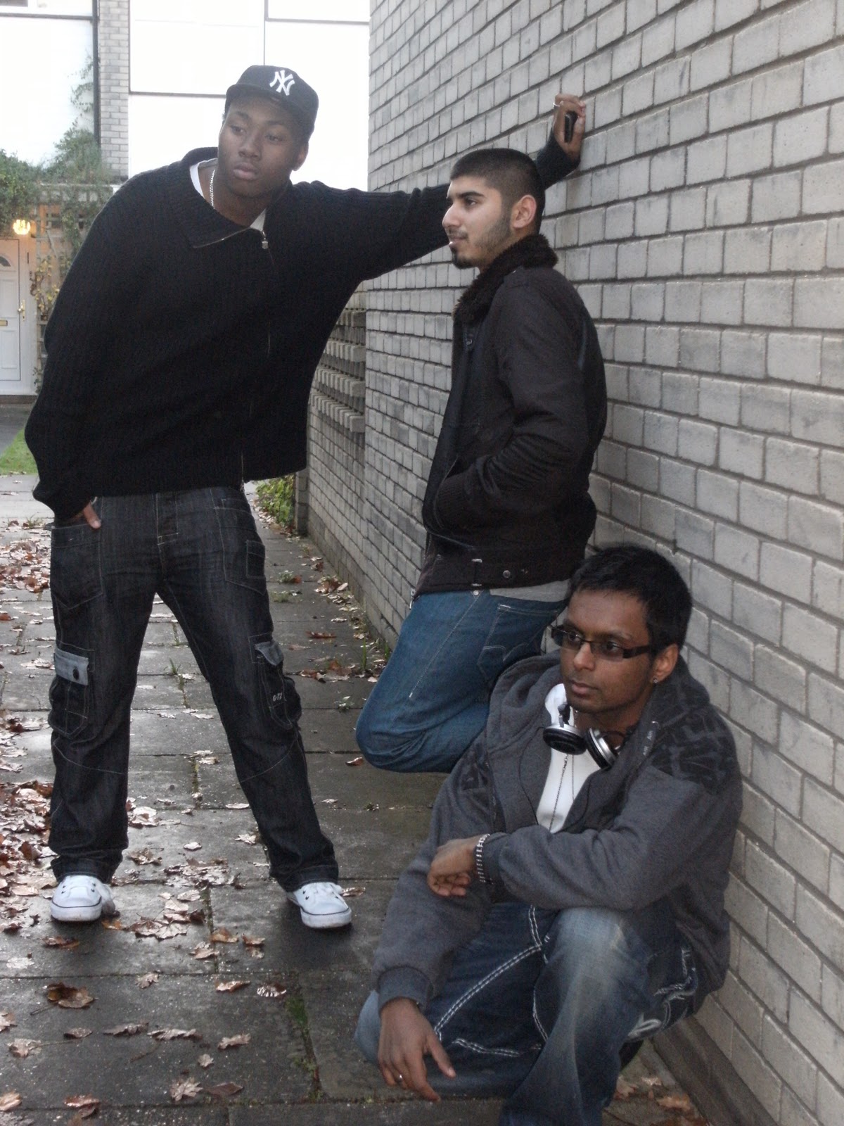
However, these two images above didn't fit the crop sizing and when testing that the artists' were cut off.
We decided to all use the same image as the composition of it was good, and we all felt the editing of it would be playful:
 |
| Final image used. (Three shot, long shot) |
Analysis of advertisment for Cd releases
Most album release adverts are structured with a picture in context with the music video or song so that it is familiar to the audiences. It also commonly has big font, grabbing the audiences attention.
Adverts range from posters made for its own promotion or HMV, Zavvi, iTunes promotion.
I feel that HMV adverts are the most successful as HMV as a company are popular in itself and have a wide range of audiences across the world. This means more customers are likely to purchase from there and this is more profitable.
Which is why i decided to construct my advert with HMV promotion. Here are example of other HMV CD release adverts:


Simple yet effective!
Adverts range from posters made for its own promotion or HMV, Zavvi, iTunes promotion.
I feel that HMV adverts are the most successful as HMV as a company are popular in itself and have a wide range of audiences across the world. This means more customers are likely to purchase from there and this is more profitable.
Which is why i decided to construct my advert with HMV promotion. Here are example of other HMV CD release adverts:


Simple yet effective!
Digipack: Analysis of CD Covers
Analysis of Hip hop CD covers
Here are a range of UK hip hop/grime artists and their album covers. Although we decided to make our CD a single, I've looked at a range of album cover artwork.
The following two CD covers are both single CD covers. I analyzed these two in particular because their both typical to our song in its genre and most importantly are songs that feature other artists. The only difference is these two songs in particular are songs with various artists featured however with our song only two artists are featured:
Overall this CD analysis has made me come to the realization that these album covers give away the genre through aspects of its mis-en-scene. The location, the costume,typography and the artist make this obvious. I have also realized that most of the CD covers relate to the title name for example as shown above, Bashy - Life, Tinchy Stryder - Game Over and Scorcher's Leader of the new school which led me to my a few ideas for my CD pack. I wanted the location, costume and the song title to relate to the cover so that it would be familiar to the audience.
Here are a range of UK hip hop/grime artists and their album covers. Although we decided to make our CD a single, I've looked at a range of album cover artwork.
 | ||||
| Wiley - Grime wave: His album artwork looks like he is on a brick rooftop with stairs behind him. He's looking straight to the camera and this is a medium long shot. The font on the cover is bubble writing and is colorful too, its similar to graffiti and this is something popular in the hip hop culture. The location is urban and along with the font it is a typical hip hop/ grime representation. |
 |
| This is Scorcher's Leader of the new school album cover. It looks like it has been created with using many effects. His attire in the picture is a typical hip hop outfit as he has a hoodie on with the hood up. The camera is positioned below him as he looks down on it. Its also a medium close up and the camera together makes him look superior, hence the title of the album 'Leader of the new school. The building behind him look new and expensive almost as if its the city. |
 |
| This is Bashy's Life album cover. Despite the sophisticated fonts the font of his jumper suggests his hop hop culture as it is graffiti like. You can see he is wearing an earring on his right ear which is also commonly seen in this culture. This is a medium close up, yet he looks down and the location behind him is in a variable focus blur. His body language relates to the title 'Life' as it seems like its as if he's looking at his life. |
The following two CD covers are both single CD covers. I analyzed these two in particular because their both typical to our song in its genre and most importantly are songs that feature other artists. The only difference is these two songs in particular are songs with various artists featured however with our song only two artists are featured:
 | |
| The Tinchy Stryder Game over song features the likes of Tinie Tempah, Professor Green, Devlin, Example, Chipmunk and Giggs on it. These artists are currently very popular and have a wide audience. The cover is done in a game like representation hence the song 'Game over' a half body shot of each artist is on the cover with the main artist Tinchy Stryder in the middle. The font is in a game like font too. A way in which the costumers can notice the genre is through the way the artists are dressed. More than one of them are wearing shades, hoodies, and also a hat. As mentioned before they're attire is typical of the hip hop culture and this is the most obvious way the artist give away the genre of music from the cover. From this cover part of my idea was to have all the artists on the cover or similar to the cover below. |
 | ||||
| This is a Single CD cover for 'She likes to' By Wiley, featuring Ice-Kid, Wrigley, Ghetts, Scorcher, Wretch 32, J2K, Chipmunk, Bashy and Griminal. As there were so many artists featured on the track I feel that maybe the artist decided to have only himself on the cover. Not many aspects of this cover can be analysed as there isn't much on it apart of a close up of the artist and the title. However, this was also an idea i had; to have only the main artist on the cover. |
Overall this CD analysis has made me come to the realization that these album covers give away the genre through aspects of its mis-en-scene. The location, the costume,typography and the artist make this obvious. I have also realized that most of the CD covers relate to the title name for example as shown above, Bashy - Life, Tinchy Stryder - Game Over and Scorcher's Leader of the new school which led me to my a few ideas for my CD pack. I wanted the location, costume and the song title to relate to the cover so that it would be familiar to the audience.
Subscribe to:
Posts (Atom)